If you searched for how to make gifts look more expensive, you probably want the recipient to feel delighted before they even open the box, without spending a fortune. The good news is that perceived value comes from cues you can control: materials, presentation, story, and small sensory details. This article explains why those cues matter, then gives step by step strategies you can apply whether you are wrapping a $10 book or a handcrafted piece that cost hundreds, so the moment of unboxing feels thoughtful, deliberate, and a little elevated.
Quick answer: simple rules that lift perceived value
- Use a clean, structured package. A sturdy box or a neat cloth wrap sets the baseline for looking expensive.
- Limit the color palette to two or three complementary tones. Neutral tones with one accent color read as sophisticated.
- Choose tactile materials. Velvet pouches, thick ribbon, and cotton twine give weight and luxury cues.
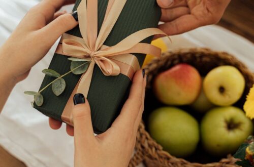
- Add a sensory finishing touch. A sprig of greenery, a wax seal, or a faint scent makes the experience memorable.
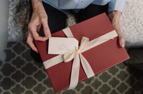
- Tell a short story. A handwritten note or a tag with provenance or meaning increases emotional value.
Follow these five rules and you will change how the gift is perceived. Now let us unpack the how and why, with practical techniques and realistic examples.
Why packaging and presentation shape perceived value
Perception is a fast, efficient mental shortcut. People make a quick judgment based on first impressions, often using cues like weight, texture, and symmetry. For example, a heavy paperboard box signals durability, while a carefully tied ribbon signals time invested. A 2019 consumer psychology review found that packaging affects expectations of quality, and that those expectations then affect satisfaction with the gift. So improving presentation changes how the gift is experienced, not just how it looks.
Imagine two scenarios: a friend gives you a sentimental ceramic mug wrapped in a crumpled newspaper, and another friend gives the same mug in a small navy box with velvet lining and a handwritten note. Both mugs are identical, but the second one feels more deliberate and valuable because of the effort and materials that surround it. That contrast shows how presentation writes part of the story for the recipient.
Packaging and materials: the foundational tricks
Start with the container. A cheap, floppy bag undermines even an expensive item, while a well-chosen box elevates a modest one. Sturdy rigid boxes, magnetic closure boxes, and wooden boxes provide structure, preserving shape and creating a tactile first impression. Consider dimension and proportion as well. A small item in a box that is just slightly larger than the object creates a snug, curated feeling. A box that is far too big looks careless and cheap, because it suggests you did not invest in the presentation.
Real-life example: Maria wanted her brother’s anniversary gift to feel special. She ordered a rigid kraft box sized to fit the watch and a little suede pouch. The box’s lid clicked when closed, and the suede muffled the watch’s movement. When her brother opened it, the mechanical sound and snug fit made the watch feel like a found treasure, not a last-minute pick. The tactile detail became part of the memory.
Another scenario: on a budget, Sam wrapped a candle in a small recycled box, added tissue paper, and sealed it with a custom sticker he printed at home. The extra layer of tissue and a neat sticker transformed a plain candle into a curated present. The lesson is that structure and layered packaging trump expensive wrapping paper every time.
Materials that read as high-end
- Thick paperboard or rigid boxes, 1.5 to 2.5 mm for a firm feel, signal durability.
- Cotton or linen ribbon instead of plastic or thin satin for a matte, refined finish.
- Velvet or suede pouches for jewelry; the soft texture conveys care.
- Vellum or tissue paper to create layers and a reveal moment.
- Wax seals, metal stickers, or embossed tags for a small but powerful upgrade.
If you do not want to buy special boxes, consider repurposing quality shoeboxes or gift boxes from boutique stores, then rewrap them to match your aesthetic. That small investment in a sturdy container multiplies perceived value compared to fancy wrapping paper on a flimsy base.
Design and styling: color, scale, and restraint
Less is usually more. Luxury brands use minimal palettes and clear negative space to communicate confidence. Choose two complementary colors and one accent. Neutrals like cream, navy, deep green, or black paired with a metallic accent like gold or copper look elevated without being showy.
Real-world scenario: Keisha wanted a present to look pricey for her boss. She wrapped a notebook in matte black paper, added a single copper sticker, and tied thin black cotton twine. The restrained design matched the office aesthetic and made the gift feel professional and thoughtful. The single metallic accent gave just enough contrast to catch the eye.
Another example: for a casual friend, Julian used kraft paper with a sage green ribbon and a sprig of rosemary. The neutral base and organic accent read as intentional and curated, which felt expensive despite low cost materials. The green also suggested freshness and care, tying the aesthetic to the recipient’s love of cooking.
Proportion, alignment, and finishing touches
- Keep edges crisp. Use a bone folder or the back of a spoon to crease paper for sharp lines.
- Center labels and tags and align ribbons symmetrically for a professional look.
- Trim loose threads and remove price tags from visible items, to avoid breaking the illusion of intentionality.
- Match textures. If the box is matte, avoid glossy bows that create visual mismatch.
Small details like crisp folds and clean edges are cognitive shortcuts the brain reads as care. Paying attention to these tactile details changes how the recipient interprets the giver’s effort and intent.
Layering, unboxing, and narrative: creating a moment
A great gift does more than look pretty. It reveals itself across small stages, creating a minute-long ceremony that amplifies meaning. Think in layers: outer wrap, inner reveal, the object wrap, and the note. Each layer should build curiosity and feel deliberate. This staged unboxing is the difference between handing over a bag and offering an experience that will be remembered.
Anecdote one: At a birthday dinner, Priya gave her partner a small box wrapped in tea-stained tissue, then a velvet pouch, then the ring. Each step slowed the moment and deepened the emotional reaction. The tactile progression, from plain paper to soft velvet to cool metal, made the ring feel like a climax, not just an object.
Anecdote two: For a retirement party, Raj presented a leather-bound journal in a wooden box lined with kraft. He included a card explaining why each entry page was reserved for a specific memory. The layered presentation made the gift feel purposeful, and the note gave the journal a role beyond paper, making it a vessel for shared stories.
Practical layering tips
- Tissue or crinkle paper provides cushion and sound. The rustle effects anticipation.
- Use a liner such as felt or velvet for jewelry to create a soft contrast with hard materials.
- Include a small card or label that explains provenance, craftsmanship, or a short message to anchor the narrative.
The narrative is especially powerful for handmade, artisanal, or heirloom gifts. Sharing a one-sentence provenance detail, like where a soap was made or who crafted a scarf, instantly increases perceived value by connecting the object to a human story.
Personalization and storytelling: emotional value beats sticker price
Personalization is not just about adding a name. It is about connecting the gift to the recipient’s identity, memories, or aspirations. A small, specific detail often outweighs a generic expensive item. Psychologists call this the “self-referential effect”, where information tied to the self is remembered more vividly. A short, handwritten note explaining why you chose the gift injects meaning that raises perceived worth beyond the material cost.
Example one: Naomi bought an artisan tea blend and included a note that referenced the recipient’s habit of afternoon reading. She also wrapped the tin with a bookmark she had pressed between pages. That connection to an intimate habit made the tea feel curated and thoughtful, which increased its emotional value.
Example two: A friend gave Marcus a photo book with tickets, restaurant napkins, and a map from shared trips. The physical artifacts embedded in the book made it tactile and unique. Even though the photo printing cost was modest, the emotional narrative turned the album into a keepsake with high perceived worth.
Ways to personalize without custom manufacturing
- Handwritten notes or postcards that mention specific memories or reasons for the gift.
- Customized playlists or QR codes linking to a curated playlist embedded in a small card.
- Monogrammed stickers or initials added to tags or pouches for a classy touch.
- Provenance cards that explain where and how an artisanal item was made, giving it context.
These touches are low cost but psychologically potent, because they transform an object into a story. Stories signal care and effort, which consumers interpret as value, even when the monetary cost is low.
Sensory cues: sight, touch, sound, and smell
Luxury is multisensory. People evaluate gifts using multiple senses almost simultaneously. A soft ribbon, a weighty box, the rustle of tissue, and a faint scent all combine to create a coherent sense of value. Missing one sense can make the package feel unfinished. For example, a gift that looks elegant but smells like plastic will create dissonance that lowers perceived quality.
Scenario one: Elena wrapped a scented candle in a matte black box, and tucked a single dried lavender stem under the ribbon. The faint lavender as the box opened complemented the candle, creating an immersive moment that felt upscale. The scent acted like a signature, tying the presentation to the object inside.
Scenario two: for a men’s gift, Omar used a heavy, magnet-closure box that made a soft click when closed. That audible click became part of the reveal ritual and felt satisfying in a way cheap packaging cannot replicate. The physical sensation of the box closing and opening delivers small but potent luxury cues.
How to add sensory details responsibly
- Use unscented tissue if the recipient has allergies, but include a tiny scented sachet separately to avoid overwhelming the gift.
- Choose natural accents like eucalyptus or rosemary for a subtle scent that will not clash with the gift.
- Include a textured interior like felt or velvet to create a soft landing for delicate items.
- Sound elements, such as a snap closure or layered packaging that rustles when moved, add anticipation.
Sensory details should enhance the gift without overshadowing it. The goal is cohesion, so the scent, sound, and texture all reinforce your message about the gift’s meaning or purpose.
Practical tools and low-cost upgrades
You do not need a pro kit to make gifts look expensive. A few simple tools and supplies transform amateur wrapping into polished work. Invest in these basics and they will pay off every time you wrap for birthdays, holidays, or small celebrations.
Anecdote one: Lina bought a bone folder, a small roll of double-sided tape, and some navy ribbon. With those three items she consistently produced crisp corners and invisible joins. Her friends started commenting that her gifts looked like they came from a boutique, not a kitchen table.
Anecdote two: Diego kept a stash of velvet pouches and metal tags. At a party he used the pouches for small gifts instead of gift bags. Guests immediately used words like “special” and “keepsake” when describing the unboxing, and several asked where he got the pouches.
Budget-friendly supply list
- Sturdy kraft or matte wrapping paper
- Bone folder or ruler for crisp folds
- Double-sided tape for invisible seams
- Cotton or linen ribbon, and a thinner accent ribbon
- Small velvet pouches or tissue for interiors
- Wax seal kit or metallic labels for finishing touches
Even a single refined element, like a wax seal or a velvet pouch, can elevate an otherwise ordinary presentation, making the recipient feel noticed and valued.
Sustainable and budget-conscious ways to look luxe
Looking expensive does not require wasteful spending. Sustainability and perceived quality can work together. Reusable cloth wraps, like furoshiki, signal thoughtfulness and last longer than disposable paper. Similarly, repurposing a sturdy box from a boutique purchase and rewrapping it in quality paper is both eco-friendly and effective.
Scenario one: Hannah wrapped a cookbook in a linen tea towel, tied it with twine, and included a wooden spoon. The towel was part of the gift and therefore sustainable, and the package looked intentional and refined because the wrap doubled as a gift. That approach cut down on waste while increasing perceived value.
Scenario two: A colleague found an elegant old cigar box at a thrift store, cleaned it, and lined it with felt to present a collection of small tokens. The thrifted box felt storied, and the time spent restoring and lining it made the gift feel bespoke, not cheap. The recipient loved both the content and the container.
Sustainable materials that read upscale
- Reusable cloth wraps or tea towels
- Recycled kraft boxes with a neat matte finish
- Plant-based tissue and natural twine
- Pressed flowers or dried herbs instead of plastic ornaments
These options show that perceived luxury can come from durability and thought, not waste. When the packaging becomes part of the gift, the recipient gains long-term value and you reduce single-use waste.
Common mistakes that make gifts feel cheaper
Even well-intentioned wrapping can backfire. Identifying common mistakes helps you avoid them and keep the presentation cohesive. One frequent error is mixing too many styles, like pairing glossy metallic paper with a rustic twine, which confuses the visual message and makes the gift feel inconsistent rather than rich.
Anecdote one: Mark used shiny, patterned paper, cheap curling ribbon, and a plastic bow. Recipients commented on the “party store” look, which undercut the thoughtfulness of the present. The competing textures and low-quality ribbon created a dissonant impression.
Anecdote two: Paula wrapped an artisan scarf in a brightly colored novelty bag she found at the last minute. Even though the scarf was high quality, the bag made it feel like an afterthought. The mismatch between the item and its container lowered the perceived value significantly.
How to avoid these pitfalls
- Match the box to the item. If the gift is artisanal or minimal, choose understated packaging.
- Avoid visible price tags and barcodes. Remove or cover them before wrapping.
- Do not overload with novelty accessories. One thoughtful accent outperforms multiple cheap decorations.
- Avoid flimsy materials. Thin tissue paper or weak ribbon will read as low effort.
Cleaning up these predictable mistakes will pay off more than adding expensive accessories, because consistency and restraint communicate confidence and care.
Etiquette and authenticity: when to make a gift look more expensive
There is a difference between elevating presentation and misrepresenting value. Ethical presentation enhances the recipient’s experience and the meaning of the gift, but it should not be used to falsely imply more monetary value than exists, especially in transactional situations like business gifts. Consider context and relationship when choosing how far to lean into luxury cues.
Example one: For a wedding gift exchange, elevating a modest contribution with elegant packaging is a kind and socially appropriate gesture, since the presentation shows respect for the occasion. The gift reads as sincere and celebratory, which aligns with the social expectations of the event.
Example two: In a work scenario where policies require that gifts remain under a certain value, keep presentation tasteful but avoid implying higher monetary value than permitted. A well-wrapped notebook and a sincere note can be both professional and meaningful, without creating misunderstanding about worth.
Putting it together: step-by-step wrapping workflow
Here is a compact workflow you can follow when you want a gift to look more expensive. The steps are actionable and repeatable, and each step adds a specific value cue.
- Choose the right container. A snug, sturdy box is better than oversized or flimsy packaging.
- Line the interior. Add tissue, felt, or a small fabric liner for a soft landing.
- Wrap or cover neatly. Use a single color paper or cloth with crisp folds and invisible tape.
- Add a tactile accent. A cotton ribbon, wax seal, or velvet pouch adds weight and texture.
- Include a short handwritten note. One to three sentences telling why you chose the gift creates emotional context.
- Add a sensory flourish. A sprig of dried flower, light scent sachet, or a small sticker finalizes the reveal.
Following these steps creates a reliable unboxing arc that communicates attention and care, which are the real drivers of perceived value.
FAQ
How can I make a cheap gift look expensive without lying about its value?
Focus on presentation and story. Use a sturdy box, quality ribbon, and a handwritten note to create a curated experience. Explain why you chose the item, such as referencing a shared memory or the recipient’s taste. That emotional framing raises perceived worth without misrepresenting the item.
Is it better to use simple neutral colors or bold patterns to look luxe?
Neutral and limited palettes usually read as more sophisticated. If you prefer patterns, choose subtle, high-contrast patterns like thin stripes or a small geometric print combined with a solid ribbon. Avoid competing textures that fight for attention.
Can I make gifts look expensive sustainably?
Yes. Use reusable cloth wraps, high-quality recycled boxes, and natural accents like dried herbs. When the wrap is useful or reusable, the recipient experiences ongoing value, which feels expensive and environmentally smart at the same time.
What small finishing touches have the biggest impact?
Sturdy boxes, a clean liner, a tactile ribbon, and a handwritten card are the most effective. Additional touches like a wax seal, a sprig of greenery, or a subtle scent multiply the impact, but the core four elements deliver the largest return on effort.
How do I choose presentation for different recipients?
Match the aesthetic to the person. For professional recipients, choose clean lines, navy or cream tones, and minimal metallic accents. For creative or bohemian friends, choose textured paper, organic motifs, and warm natural elements. For family, mix nostalgia and personal notes for emotional resonance.
Conclusion
Making gifts look more expensive is less about price and more about intentionality. Structure your presentation, choose tactile, high-quality materials, keep the design restrained, layer the reveal, and add a short story or handwritten note. Those cues combine to create a memorable unboxing that feels valuable and thoughtful. When you focus on coherence and care, the recipient will notice, and the gift will feel special long after the ribbon is gone.